 webCOMAND Docs
 User Guide
 User Interface
 Views
ViewsForm View Field Types
In Form View, each field has an input and optional controls best suited for entering or selecting a value based on the type of information expected for the field.
The field types can be grouped into the following categories.
Data
Data fields represent a single named value, such as a number, text, date and/or time, true/false state, color or file or image data.
- Checkbox - Click the box input to check or uncheck.

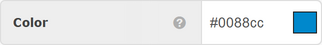
- Color - Input an RGB hex triplet web color (#RRGGBB). Click the button on the right of the input to display an interactive color picker.
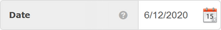
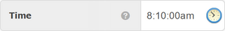
- Date/Time - Date, Time and Timestamp (date and time) fields contain a text input where a date, time or timestamp can be entered as free-form text in any of the various recognized formats including YYYY-MM-DD for dates, HH:MM:SS for times and YYYY-MM-DD HH:MM:SS for timestamps. Click the button on the right of the input to display an interactive calendar and/or time control.

- File - Upload any type of file, including Documents, Audio and Video.

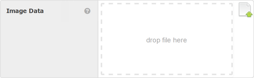
- Image - Similar to File, except specifically for storing an image in a recognized format, such as JPG, PNG, GIF.
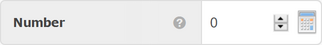
- Number - Enter a valid number or decimal in the free-form number input. Click the calculator button on the right of the input to display an interactive calculator. Once you have calculated the desired number, click "Use" in the calculator or enter on the keyboard to update the input to the last calculated value.
- Number - An integer from −2,147,483,648 to 2,147,483,647 (32 bits).
- Big Number - An integer from −9,223,372,036,854,775,808 to 9,223,372,036,854,775,807 (64 bits).
- Tiny Number - An integer from -128 to 128 (8 bits).
- Decimal - A decimal number stored as a double-precision floating point (approximate value) value (64 bits).
- Currency - A decimal number stored as "fixed-point" (exact value) with up to 20 significant digits and two decimal digits ("DECIMAL(20,2)" 64 bits).
- UUID - Enter or paste a valid Universally Unique Identifier (UUID) into the text input. Click the button on the right of the input to generate a new UUID, which will be unique to this item across all webCOMAND content databases.
- Plain Text - Stores unformatted text (no paragraphs, bullets, links, and text styles).

- Text Line - Input plain text into the input. Links, styles and other formatting is not possible.
- Text Box - Input plain text and new lines (press ENTER) into the input. Links, styles and other formatting is not possible.
- Password - Input that hides the actual characters typed, typically with a dot for each character.
- Phone Number - Input for phone numbers, which will ensure a valid phone number is entered.
- Email Address - Input for email addresses, which will ensure a valid email address is entered.
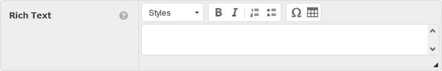
- Rich Text - Input text and use the toolbar controls to add links, styles and other formatting. For more information, see Rich Text Editor.
- Rich Text Box - Multiple lines of text, which may include line breaks and paragraphs.
- Rich Text Line - A single line of text with no line breaks or paragraphs.
- Source Code - Input plaintext code in any programming language. Line numbers are displayed on the left and supported programming languages will syntax highlighted to make the code easier to read. Bracket highlight, find/replace and other features are also available.

Relationships
- Link Item - Click the down-arrow to the far right to open collection view where you can search and select the desired item. To deselect an item, click the down-arrow and then the small circle containing an "x" to the left of the selection. Click the up-arrow to the right to close the collection view.
- Link List - Click the down-arrow to the far right to open collection view where you can search and select items with their corresponding checkbox or the collection toolbar controls. Click the up-arrow to the right to close the collection view.
- Back Link - Similar to a Link List, except the field values are automatically populated with a list of objects that Link to this object through a specific field. The values must be updated by changing the value of the corresponding Link Item/List field in the source objects.
- Embed Item - Click the "+" control on the far right to create an embedded item that is not created yet. If multiple types of content are allowed, a menu will display so that you can select the desired content type. The embedded content will display its own fields, which can be input directly from the parent item. Click the trash option to delete an existing embedded item.
- Embed List - If an embedded list is collapsed, click the down-arrow to the right. Once expanded, items can be managed in List View, or any supported collection view.
Layout
In addition to fields that accept input, there are also a few form elements that help organize and explain the fields.
- Comment - A note to display.
- Group - Group a set of fields together in a box that can be expanded/collapsed.
- Heading - A title to display.
- Tab - Group a set of fields together within a tab that will be hidden until the tab is activated.
For more information about field types, see Content Type Fields.