 webCOMAND Docs
 User Guide
 User Interface
 Panels
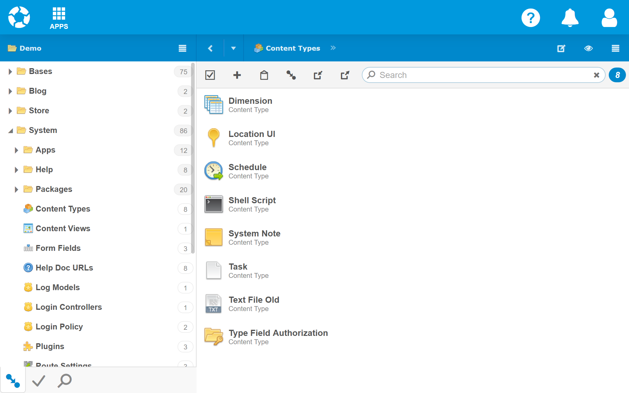
Panels
Most apps display content in panels that share a common look and controls. For example, Content Manager has two panels, one to browse content (on left), and one to list and edit content (on right).
Navigation Bar
Each panel has a Navigation Bar at the top with information about the displayed content, options to adjust how it is viewed, and controls to navigate relative to the displayed content or collection.

- Back - Similar to the back button in a web browser, it steps back through the content previously displayed in the panel. Click to return to the previous content. Click the drop arrow to the right to reveal the full history and other navigation options. It only displays when there is a history.
- Title - The center area can display the title, summary or path of the content or collection displayed in the panel's view below. Click the title to refresh the view. Click and drag to move, copy or link the panel content or collection to the quick link bar or a container such as a folder displayed in the tree view. Use the double-arrow to expand/collapse the full path.

- Panel Options - A menu on the far-right reveals options to configure and customize the panel and view. Commonly used options appear just left of the menu when there is room.
- Edit Path (
 ) - Toggle between the title/path and the path editor, which reveals the cQuery used to retrieve the content displayed in the panel. Modify it to display different content.

- View (
 ) - Select a different view compatible with the content or collection. The current view is highlighted. Select "Automatic" to let the system choose the best view.
 - Hide/Show Toolbar - Show or hide the collection toolbar or object toolbar.
- Hide/Show View Bar - Show or hide any toolbars associated with the current view.
- Edit Path (
Toolbars
The toolbar below the Navigation Bar includes options to interact with the panel's content. If the options don't all fit in a toolbar, a drop-down menu (three vertical dots) will reveal more.
The toolbar will take one of two forms, depending on the content displayed in the panel.
Collection Toolbar
The Collection Toolbar appears when multiple content items are (or could be) displayed in the panel.

 Select - Enable Select Mode to work with multiple items. Double-click to select all items.
 Add - Create a new item in the collection.
 Paste - Paste or link cut or copied item(s) into the collection. If copied or cut from embedded, paste will clone (if cut, will also remove from source). Otherwise, if cut paste will unlink from source and link to target, or if copied paste will clone and link to target folder if applicable.
 Import - Import items into the collection from a CSV, JSON or ZIP file.
 Export - Export items in the collection to a CSV, JSON or ZIP file.
 Search - Filter items by keyword or cPath filter. All text and numeric fields of each item will be searched. For more information, see Search.
- Item Count - Number of items in the collection or matching search.
If all options do not fit in the toolbar or some are less frequently used, a drop-down menu will reveal additional options.
Collection Toolbar: Workflow Menu
If the collection has been modified (ie. the records, order or hierarchy has changed), a Workflow Menu will display on the left. If the modifications have not been saved, the Save option will display before the Workflow Menu. If the modifications have not been approved, the Approve option will display. Click the Workflow Menu to display all options: Approve, Save and Revert to Last Approved.

Collection Toolbar: Select Mode
To enable Select Mode, click Select ( ) or select one or more content items. In Select Mode, the Select option will be blue with a drop-down menu, and the options to the right are different.

- Select - Exit Select Mode. Double-click toggles between select all (if not all selected) and select none (if all selected). Click the drop-down menu to adjust the current selection.
 Open - Open selected items (filter current collection down to selected items).
 Batch Edit - Update a field in all selected items. Learn more.
 Cut - Cut selected items to clipboard. They will not be removed until pasted.
 Copy - Copy selected items to clipboard.
 Delete - Delete or unlink selected items from collection. Unlink is only an option when collection is a folder or reference field.
- Export - Export selected items in the collection to a CSV, JSON or ZIP file.
 Workflow - Menu to Approve, Save or Revert to Last Approved (and Publish and Preview when applicable) selected collection content.
- Search - Filter items by keyword or cPath filter. All text and numeric fields of each item will be searched. For more information, see Search.
- Selection Count - Number of items selected.
Object Toolbar
The Object Toolbar displays the workflow menu (left) and options menu (right) when a single content record is opened in the panel.

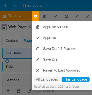 Workflow Menu - Options to update the content's workflow state after modifications are made, including Approve, Save and Revert to Last Approved (and Publish and Preview when applicable). Different options may be available based on your user role and custom workflows. If content modifications are not in the final workflow state (typically approved/published), a colorful shortcut to the next logical workflow step will display to the left of the workflow menu. Click the menu to display all available workflow options. Typical options are:
- Approve & Publish - Approve the working copy of the content to become the new official active content and publish to the production website or app.
- Approve - Approve the working copy of the content to become the new official active content. If the content can be published, the button label will be Publish instead, to indicate that the content will be approved and published to the production website or app.
- Save Draft & Preview - If the content can be previewed, this button will first save a new draft and then publish a preview to the staging website or app.
- Save Draft - Save the working copy of the content for as a new version. If version control is enabled, there will be an option to rollback the content to this version after future changes are made.
- Revert to Last Approved - Revert the working copy to the last approved version of the content and go back to the previous panel content, like Back was clicked.
- Content Type Actions - Each content type may have it's own specific actions as well, which appear after the workflow actions above. If all actions do not fit in the toolbar, a drop-down menu will reveal additional actions.
- Options - On the right of the toolbar are options related to the current content object.
- New - Add a new object of the same type to the same parent folder or collection, if one exists.
- Cut - If the path to the current object is through a parent folder or collection, "cut" it from that parent, so a subsequent paste operation will effectively move it to another folder or collection.
- Copy - Copy the current content, so it can be moved (pasted) to another folder or collection.
- Delete - Remove the current content from the repository, including all links to it.
- Edit Type - Launch the Content Type Editor for the item content type.
If there are unsaved changes, the Save (or Preview) option will appear left of the Workflow Menu:

If there are unapproved changes, the Approve (or Publish) option will appear left of the Workflow Menu:

Hover over (or tap) the toolbar to reveal the expand options:

Expand a menu to display the menu items on the toolbar for direct access:

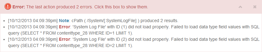
Alert Bar
The Alert Bar displays issues and notes, typically based on the last operation performed. It only appears when there is new information to display, and remains opened until it is closed.
Controls
- Roll-up / Expand - To roll-up the panel, click or tap the up arrow, or anywhere to the left of it. To expand the panel, click or tap the down arrow, or anywhere to the left of it.
- Close - To hide the panel, click or tap the X. The panel will remain hidden until the next important update. Notices and progress updates will not reopen the panel.