 webCOMAND Docs
 User Guide
 User Interface
 Views
ViewsContent Type Editor View
The Content Type Editor View is used to edit the fields and functionality of a Content Type.
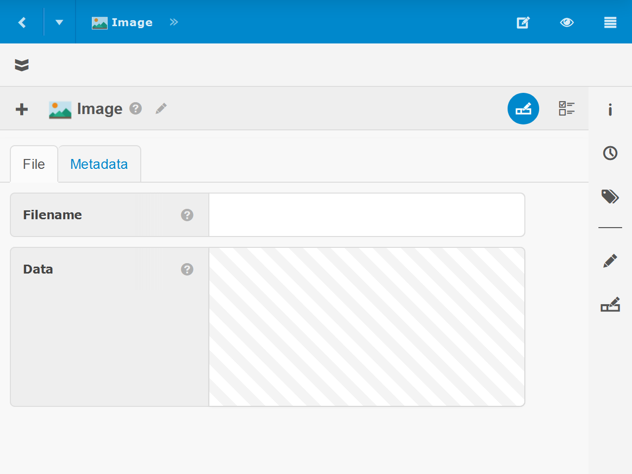
Fields
Content Type fields appear in the Content Type Editor similar to Form View. However, instead of options and inputs to edit content field values, you edit the fields themselves.
 Add a Field
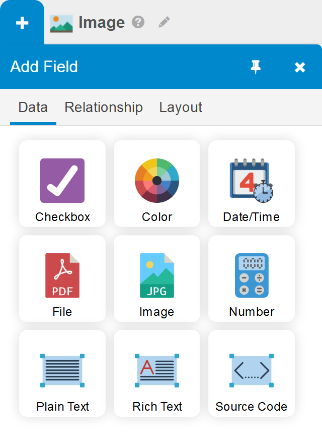
To add a new Field:
- Click "+" in the upper-left.
- Click the desired Field Type, which are organized as outlined in Form View Field Types.
Field Types are organized into the following tabs.
- Data - Data fields represent a single named value, such as a number, text, date and/or time, true/false state, color or file or image data.
- Relationship - Used to relate a field to other content items.
- Layout - In addition to fields that accept input, there are also a few form elements that help organize and explain the fields.
Edit a Field
To edit an existing field, click the field label to slide out the Edit Field Sidebar.
Reposition a Field
To change the field position within the form, drag-and-drop the field label within the form.
To move a field into a tab or group that is not yet visible, first drag the field over the tab or group heading and hold it there for a second. The tab or group will expand, where you can then continue to drag-and-drop the field into position.
Delete a Field
To delete an existing field, click the field label to slide out the Edit Field Sidebar, and then click the delete button in the upper-right of the sidebar.
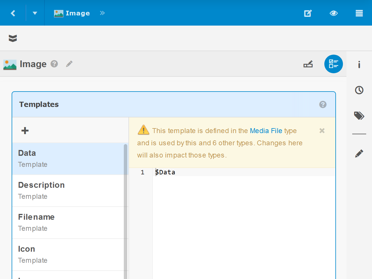
Templates
Content Type Templates, also known as cTemplate Methods, define Content Type functionality. To manage them, click the Templates option in the upper-right.
Add a Template
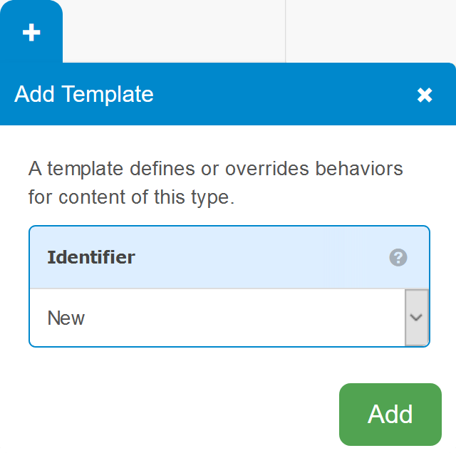 To add a new Template:
- Click "+" within the Templates box.
- Select the desired Identifier from the drop-down, or select "Other" and enter a customer Identifier.
- Click Add.
The new Template will appear in the list on the left and open for editing on the right.
Edit a Template
To edit an existing Template, click the Identifier on the left.
Rename a Template
To rename a Template and/or edit it's description, hover over the Template's Identifier on the left and click the gear option.
Delete a Template
To delete a Template, hover over the Template's Identifier on the left and click the delete option.
Sidebars
Buttons down the right side of the Content Type Editor View slide out sidebars with additional information and options. These include the same Info, Versions and Related sidebars available in Form View.
Edit Type Sidebar
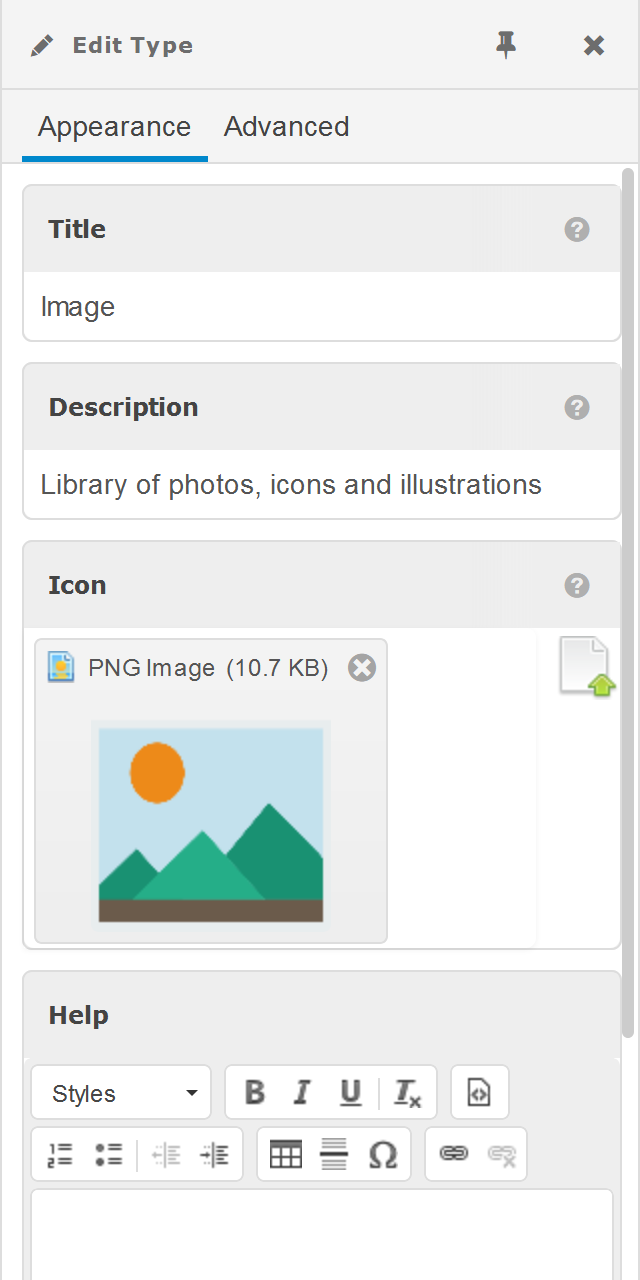 Display the following Content Type metadata and advanced options.
- Title - The name, as it will appear to content editors.
- Description - A brief description, as it will appear to content editors in Bases Content and other places.
- Icon - The icon, as it will appear to content editors in Bases and throughout the user interface.
- Help - Long-form help, which will be available from the help option to the right of the Content Type name in Form View.
- Extends - The Content Type this Content Type inherits Fields and Templates from.
- Identifier - The unique ID, which is how this Content Type is referenced by developers in queries, scripts and other places.
- Plural - The plural version of the Title as it appears in Bases and other views. This is automatically populated, but can be customized if the automatic plural is incorrect or undesirable.
- Orderable - Check to make content of this type orderable within a Folders.
- Max Versions - The maximum number of past versions of content of this type to retain in Version Control.
- Package - Optional Package to associate this Content Type with.
- Class Name - Optional path and name of the Content Type Model within the selected Package to associate this Content Type with.
Edit Field Sidebar
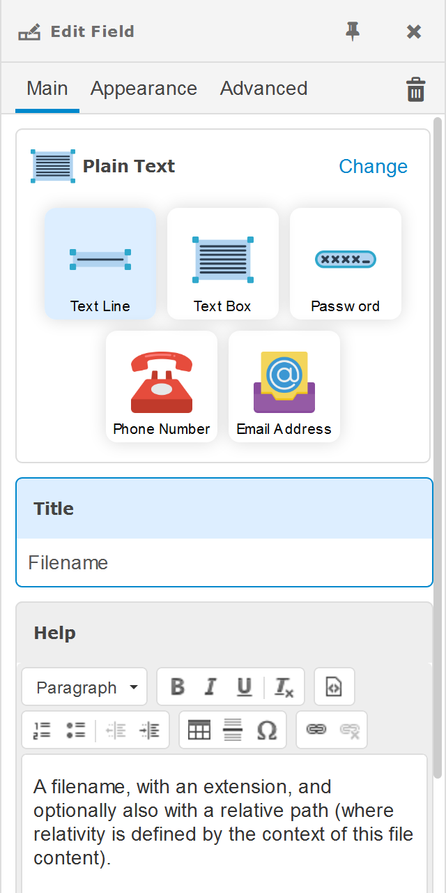 Display the following Field metadata and options. Some options are only for certain Field Types.
- Field Type - Fine-tune or completely change the field type selected when the field was first created. Keep in mind that depending on the change, all content field values may be lost if the new type is not able to preserve existing field values.
- Data - When the field is a data type (e.g. Number or Text), options will be displayed to refine how the data is input, validated and stored.
- Relationships - When the field is a content relationship, the following options are available.
- Link / Embed - Link to existing content by reference, or embed content within the item.
- Single / List - Connect items to a single content item (one-to-one relationship), or list of items (one-to-many relationship).
- Back - If the relationship content type already has a relationship to this content type, this option will establish a many-to-one or many-to-many relationship.
- Choose related from - Option to limit related item selection to content in a specific Folder/Base or cPath (click in input to add a custom cPath).
- Title - The name that will appear in the field label and throughout the user interface.
- Help - An explanation of the field and possible or recommended inputs, which will be available from the help option in the field label.
- Show - Include the field in the automatic content summary that represents the content throughout the user interface, such as in lists. This will also cause the field to be displayed as a column in Grid View, by default.
- Form Width - The width of the field input in Form View.
- Form Height - The height of the field input. Only available for fields that contain text, lists or other information taller than a single line.
- Expanded - Expand the group or relationship field drop-down by default.
- Choices - Define a list of options for selection for Data Field Types, rather than free-form input. Select Values to enter title/value pairs manually. Select cPath to enter a cPath where the content Summary will be used for the Title and their Key will be used for the value.
- Identifier - The unique name for this field that will be used by developers to reference the field from queries, scripts and the API.
- Unique/Key - Check to require field values to be globally unique from one another. This will also optimize query match performance for this field because it will be indexed in underlying databases. Only available for Data Field Types.
- Is cTemplate - Checked in the text field should be evaluated for cTemplate.
- Allow Add - Check to make it possible to add content directly from a Link field. New content will be linked, and added to the folder defined in for the Field Location, if any. Only available for Relationship Link Field Types.
- Orderable - Only available for Relationship Field Types.
- Non-Variant - Check to indicate the field value will remain the same across variants. Only applicable to a field when the Content Type utilizes Dimensions.
- Validations - Defines field value requirements, including if it is required, minimum and maximum values/Links, etc.