 webCOMAND Docs
 User Guide
Panels
The Dashboard and many applications display content in panels that share a common look and controls. For example, Content Manager typically shows two panels, one on the left to browse content, and one on the right to list and edit content.
Navigation Bar
Each panel has a navigation bar at the top with a control to navigate back and to other content relative to the current content or collection. It also provides high-level information about the displayed content, and options to adjust how it is displayed.

- Back - Similar to the back button in a web browser, it steps back through the content previously displayed in the panel. Click to return to the previous content. Click the drop arrow to the right to reveal the full history and jump back or forward to any point.
- Title - The center area can display the title, summary or path of the content item or collection displayed in the panel's view below. Click the title to refresh the view. Click and drag to move, copy or link the panel content or collection to the quick link bar or a container such as a folder displayed in the tree view. The double-arrow will expand/collapse the full path.

- Panel Options - A menu on the far-right reveals options to configure and customize the panel and view. Commonly used options appear just left of the menu when there is room.
- Edit Path - Toggle between the title/path and the path editor. The path editor reveals the cPath, cQL or cQuery used to retrieve the content displayed in the panel. It can be modified to query and retrieve different content.

- Previous - Open the previous item in the parent folder or collection. The previous button may be disabled when viewing the first item, or hidden if not in a folder or collection.
- Next - Open the next item in the parent folder or collection. The next button may be disabled when viewing the last item, or hidden if not in a folder or collection.
- View - Select a different view compatible with the content or collection. The current view is highlighted. Select "Automatic" to let the system choose the best view.
- Hide/Show Toolbar - Toggle display of action buttons.
- Hide/Show View Bar - Toggle display of toolbar associated with the current view, when available.
- Add Panel - Add another top-level panel to the center, top, bottom, left or right of the interface. Panels are added under existing panels in the specified region.
- Add Child Panel - Same as Add Panel, except child panels are "chained" to the parent panel they were added from. That is, when content is opened from the parent panel, it will update all of its immediate child panels instead of updating the parent panel. A panel with no children will update when content is opened.
- Remove Panel - Removes the panel from the interface, making more room for others. This option will not be available when only one panel remains because the interface must always have at least one panel.
Toolbars
The toolbar below the navigation bar features actions that can be performed on the panel content, collection or selection. If all actions do not fit in a toolbar, a drop-down menu (three vertical dots) will reveal additional actions.
The toolbar will take one of two forms, depending on if the content displayed in the panel.
Collection Toolbar
The collection toolbar appears when multiple content items are displayed in the panel.

- Workflow - Menu to approve, save and cancel (and publish and preview when applicable) all content in the collection. If the collection has been modified (ie. the order or hierarchy has changed), a save or approve button will display to the left of the workflow menu as a shortcut.
- Select - Enables Select Mode to select multiple items for batch cut, copy, delete, etc. Double-click to also select all items.
- New - Create a new item in the collection.
- Paste - Paste the last cut or copied items into the collection. If copied or cut from embedded, paste will clone. Otherwise paste will unlink (or clone and delete embedded) from source and link to destination.
- Link - Link the last cut or copied items into the collection. If last items were cut from a reference field, the source references will be removed. If cut from no field, they will be linked as if copied. If cut from an embedded field, the embedded records will be cloned, removed and then linked.
- Import - Import items into the collection from a CSV, JSON or ZIP file.
- Export - Export items in the collection to a CSV, JSON or ZIP file.
- Search - Filter collection items by keyword or cPath filter. All text and numeric fields of each item will be searched.
- Item Count - Number of items in the collection.
If all actions do not fit in the toolbar or some are less frequently used, a drop-down menu will reveal additional actions.
Collection Toolbar: Select Mode

- Workflow - Menu to approve, save and cancel (and publish and preview when applicable) selected content in the collection. If the collection has been modified (ie. the order or hierarchy has changed), a save or approve button will display to the left of the workflow menu as a shortcut.
- Select - Exits Select Mode. Double-click toggles between select all (if not all selected) and select none (if all selected).
- Open - Open selected items (filter current collection down to selected items).
- Cut - Cut selected items to clipboard. They will not be removed until pasted.
- Copy - Copy selected items to clipboard.
- Unlink - Unlink selected items from collection. Only an option when collection is a reference field.
- Delete - Delete selected item from repository.
- Import - Import items into the collection from a CSV, JSON or ZIP file.
- Export - Export selected items in the collection to a CSV, JSON or ZIP file.
- Search - Filter collection items by keyword or cPath filter. All text and numeric fields of each item will be searched.
- Selection Count - Number of items selected.
Object Toolbar
The object toolbar will appear when a single content item is displayed in the panel.

Primary Actions
- Workflow - Menu to approve, save and cancel (and publish and preview when applicable) the displayed content. If the content has been modified, a shortcut to the next logical workflow step will display to the left of the workflow menu. Click the menu to display the following actions.
- Approve - Approve the working copy of the content to become the new official active content. If the content can be published, the button label will be Publish instead, to indicate that the content will be approved and published to the production website or app.
- Approve & Publish - Approve the working copy of the content to become the new official active content and publish to the production website or app.
- Save Draft - Save the working copy of the content for as a new version. If version control is enabled, there will be an option to rollback the content to this version after future changes are made.
- Save Draft & Preview - If the content can be previewed, this button will first save a new draft and then publish a preview to the staging website or app.
- Cancel - Revert the working copy to the last approved version of the content and go back to the previous panel content, like Back was clicked.
- New - Add a new object of the same type to the same parent folder or collection, if one exists.
- Cut - Cut the current object from the parent folder or collection, if one exists (otherwise just copy), so it can be moved (pasted) to another folder or collection.
- Copy - Copy the current content, so it can be moved (pasted) to another folder or collection.
- Delete - Remove the current content from the repository, including all links to it.
Content Type Actions
Each content type may have it's own specific actions as well, which appear after the actions listed above, but before the slide out actions listed below. If all actions do not fit in the toolbar, a drop-down menu will reveal additional actions.
Slide outs
To the right of the actions are buttons that slide out sidebars with additional information and options.
Sidebars
Publishing Sidebar
The Publishing Sidebar is only available when an object can be published. It lists:
- Publication Procedures
- Publications
- Publication Records
Dimensions Sidebar
The Dimensions Sidebar is only available when content has one or more dimensions, such as language for translations. It displays all defined dimensions with options to create new dimensions and edit the existing dimensions, including their default preference order.
 Workflow Sidebar
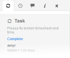 The steps of the workflow associated with the submission of this content record are displayed as blocks vertically down the sidebar. Steps completed are denoted with dark grey. The current step has a bright white background. And, steps that will come after submission are greyed out. Upon submit and successful validation, the illustrated steps will be updated to reflect the actions taken in workflow.
 Related Sidebar
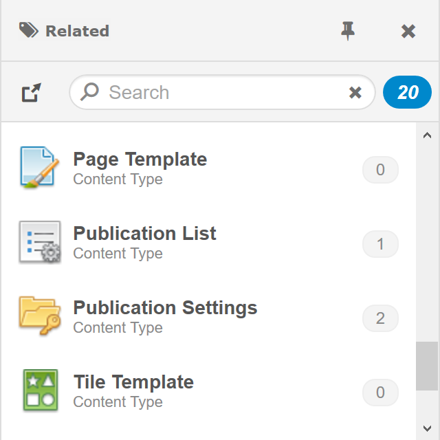 Provides access to attributes (other content that references the displayed content). A drop-down list of all content types and fields of content records that reference this content record is displayed at the top. Once selected, a summary of all matching records is displayed below. Some common attributes are Tags and Notes. Notes are text comments associated with a user, timestamp and checkbox. Once checked, the comment is considered archived and moves below all unchecked notes. The checkbox is meant to be checked once a comment has been addressed or should no longer be considered active/prominent. Use the collection bar to add a new attribute, search and change the view.
 Versions Sidebar
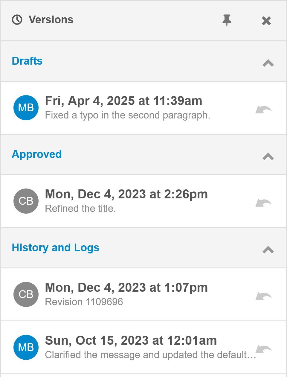 All versions of the displayed content are organized under the headings: Working Copy, Drafts (Staging), Approved (Live) and History. The Working Copy, Drafts and Active sections are expanded by default. The History section will only be visible if authorized to view version history. History must be expanded to reveal past versions. Each version shows the author, timestamp and optional version notes. Only versions still stored in the repository will open (version metadata can be maintained after versions are removed from the repository).
If authorized to view a version, it can be opened and the Approve and Save actions will disappear. Click cancel to return to the working copy. If authorized to restore, Restore will have replaced Approve and Save. Click Restore to save the working copy as a draft if different than previous draft or active version, and restore the opened version as the new working copy. From there it can be approved, saved or cancelled.
If authorized to edit version notes, hover or swipe left over a version to reveal the edit version note option.
 Info Sidebar
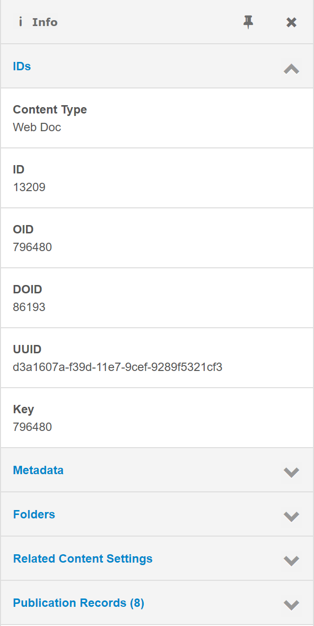 Display content record metadata, including the:
- Content Type - Hover over the content type to open or modify the content type.
- ID - The ID unique to this object across all objects of the same content type within this repository.
- OID - The Object ID unique to this object across all objects in this repository.
- UUID - The Universally Unique ID for this object across all objects in all repositories. Hover over the UUID to display options to generate a new UUID or paste a copied UUID.
- Key - The text key that is unique across all objects in the same parent field.
- Keywords - Keywords to match against for repository object searches.
- Summary - The summary text to be displayed for the title.
- Description - The description text to be displayed with the title/summary in certain collection views.
Related Folder Settings can also be expanded to show folder settings that apply to the content in the form.
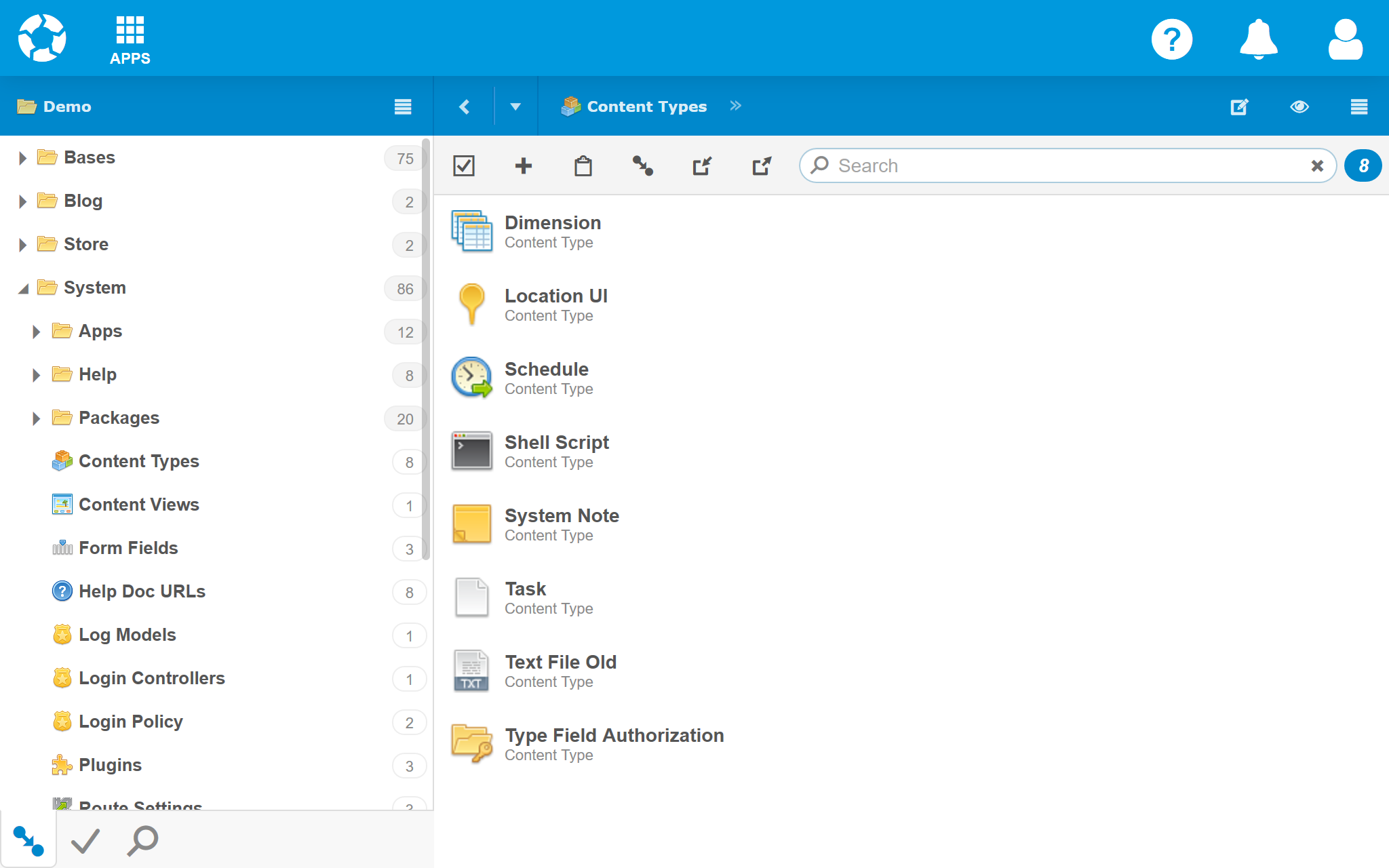
Views
The area below the Title Bar and Toolbar is the View. A view is automatically selected based on the type of content displayed, but can be manually selected as well. Several views are always available. Standard views that come with Content Manager are List, Tree, Grid and Form. More views can be added from the Market, and created by developers.
List View
List view will display the icon and title for each item in a collection. If no more specific collection view is available, List view servers as the fallback.
Tree View
Tree view displays folders and other content hierarchies.
Rows
Click a triangle to the left of a folder or other content record to show or hide it's children. Click icons and titles to open the corresponding content. Double-click, select and click or press F2 to edit the title. When in edit mode, other users will see the title field locked and highlighted in tree, grid and form view to prevent anyone else from editing the title at the same time. The number of immediate children is displayed to the right. Click and drag to reorder or move content within the hierarchy.
Grid View
Grid view displays a collection of content records in a table where each row represents a content record, and each column represents a field.
Columns
The columns can be modified to show or hide any field. The left column will always display the status of the record. For example, if a content record is locked, a lock icon is displayed. Click the column headers to sort in ascending, or again in decending order. Click and drag the column separators to resize the columns. Double-click a column separator to resize the column width to fit the widest row value (but no wider than the width of the panel - 16px).
Rows
Double-click a row to update the panel's path and display that content record. Select and then click a cell to edit the value. Arrow, Shift and Ctrl keys can be used to change the selection. Enter and F2 keys can also be used to edit the selected cell, similar to spreadsheet software. Edit mode will not be possible if the content record or field represented by the row and column is locked by another user. When in edit mode, the field will be highlighted and locked to other users viewing the content record in grid or form view.
Form View
Form view is used to display and edit a single content item.
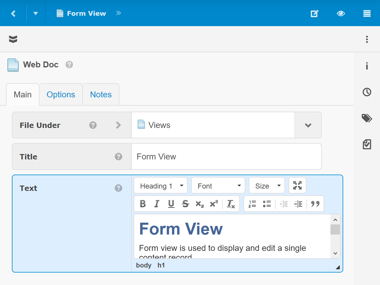
Fields
Each field within a content item is displayed on its own row with the label to the left or on top and the value input and controls to the right or below. The input and controls displayed depend on the type of field. For more information about field types, see Content Type Fields.
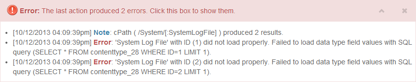
Alerts
The alerts panel is a bit different than the other panels, which display content. It displays information and issues from the system or other panels to attention.
Controls
- Roll-up / Expand - To roll-up the panel, click or tap the up arrow, or anywhere to the left of it. To expand the panel, click or tap the down arrow, or anywhere to the left of it.
- Close - To hide the panel, click or tap the X. The panel will remain hidden until the next important update. Notices and progress updates will not reopen the panel.